
Typography - Feel the Kern
Using only type elements, great a poster design based on the argument for or against the typeface Helvetica. Choice of typeface was limited to either the Helvetica family (thereby arguing for), or any expressive serif (thereby arguing against). All type needed to be kerned appropriately with no widows, orphans or awkward breaks.
Fall 2016
Project description: Using only type elements, great a poster design based on the argument for or against the typeface Helvetica. Choice of typeface was limited to either the Helvetica family (thereby arguing for), or any expressive serif (thereby arguing against). All type needed to be kerned appropriately with no widows, orphans or awkward breaks.
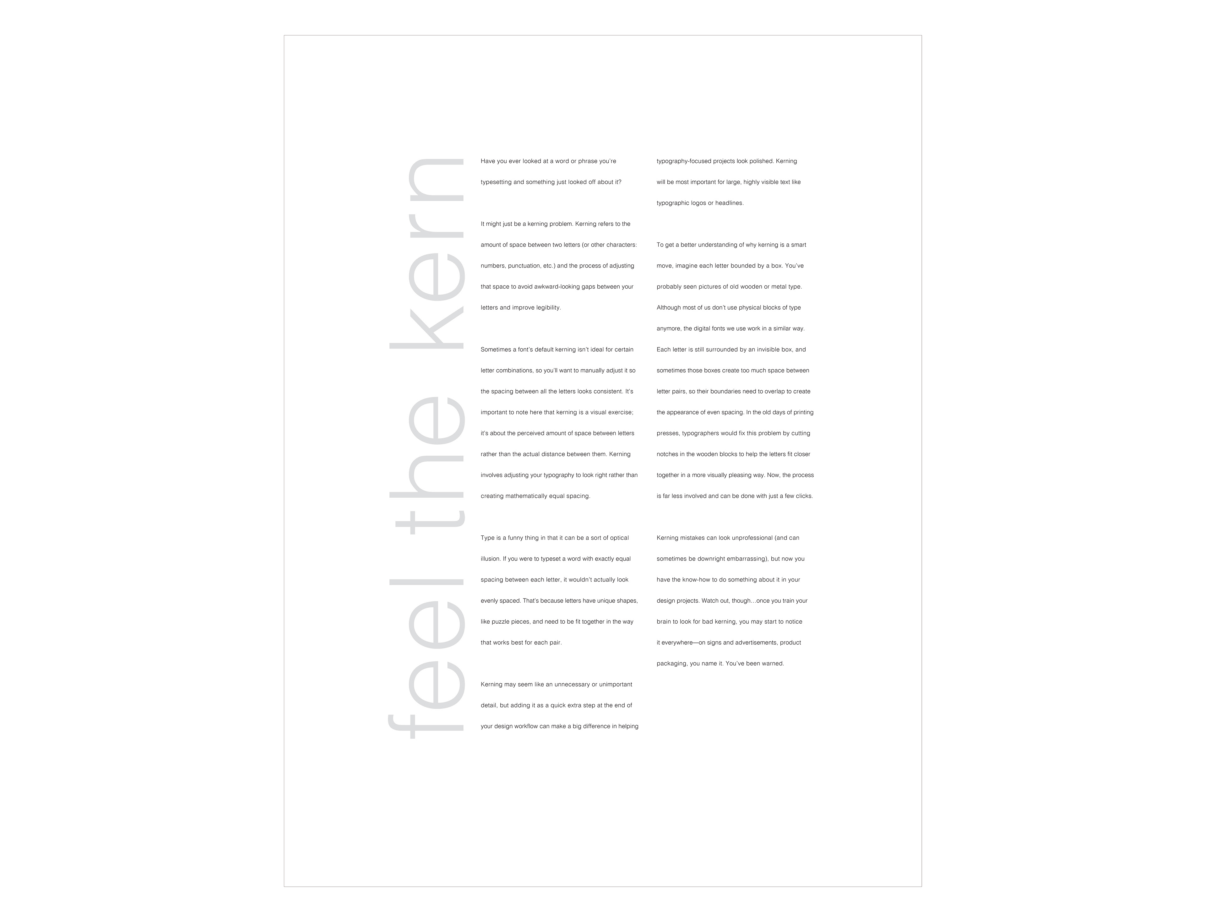
Final poster design, 18"x24"
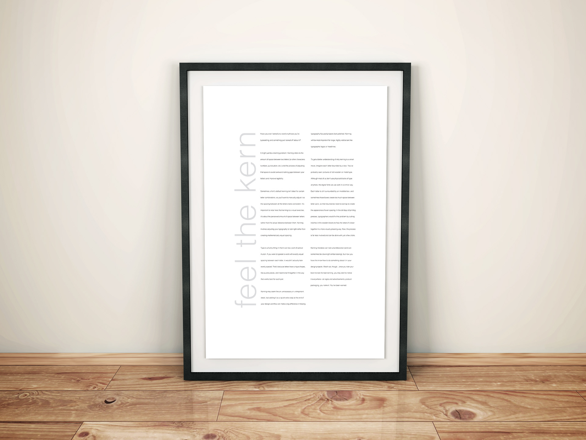
Mock-Up
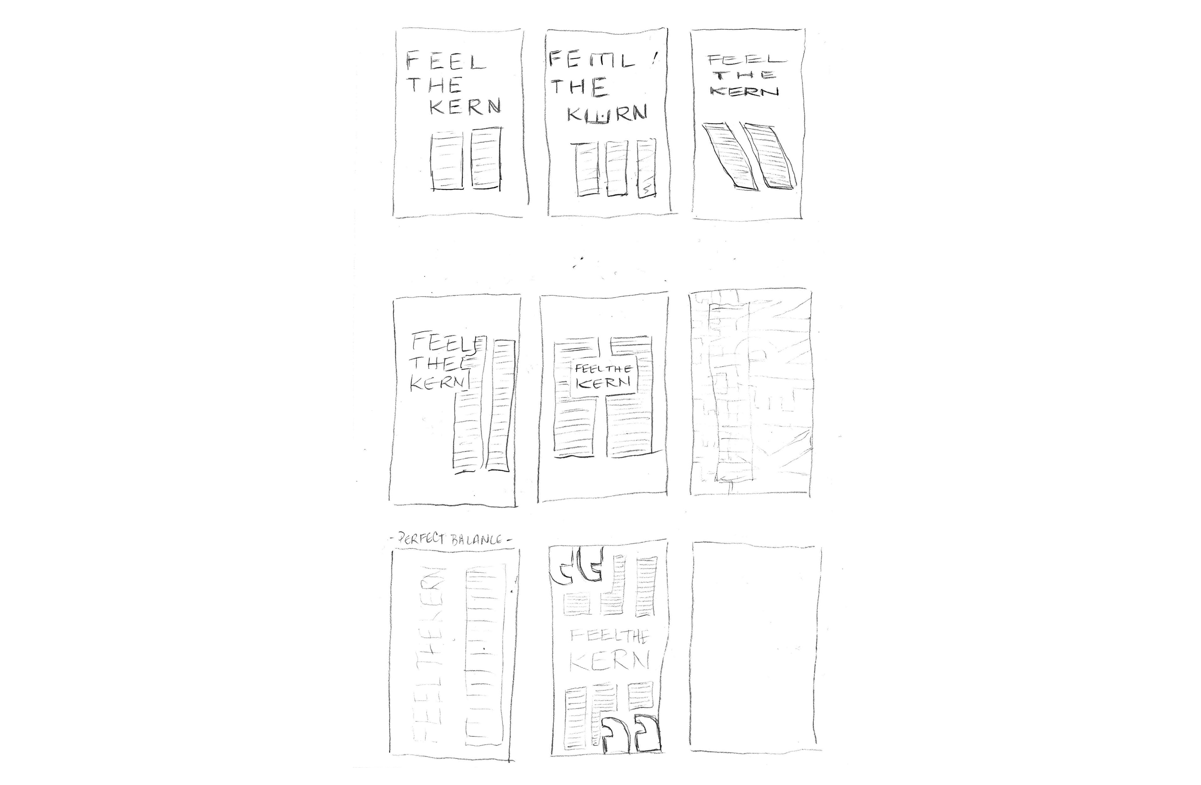
Sketches