
Boston City Flag Challenge
A friendly design challenge among colleagues to redesign the Boston city flag based on the 99% Invisible Podcast and TED talk by Roman Mars.
January 2016
Project description: A friendly design challenge among colleagues to redesign the Boston city flag based on the 99% Invisible Podcast and TED talk by Roman Mars.

Boston City Flag Version 1 - I incorporated Boston's nick name as the "hub city" and recalled the historic roots. The blue field represents the Massachusetts Bay and Boston Harbor while the gold represents the city's rich culture and history. The white ring is a symbol of loyalty and unity - the "Boston Strong" mentality of the residents. the dark blue outline represents the Charles River and the role it plays in defining Boston both geographically and culturally.
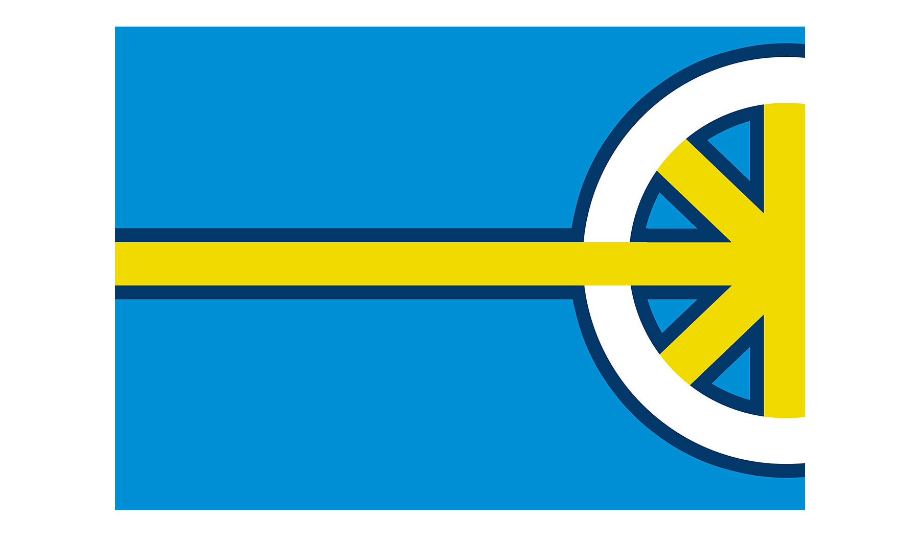
Boston City Flag Version 2 - The hub symbol was moved to the extreme right, representing the city's location geographically in the state. The yellow spoke that continues to the left side represents the Mass Pike, denoting the city's tendency to influence the rest of Massachusetts.
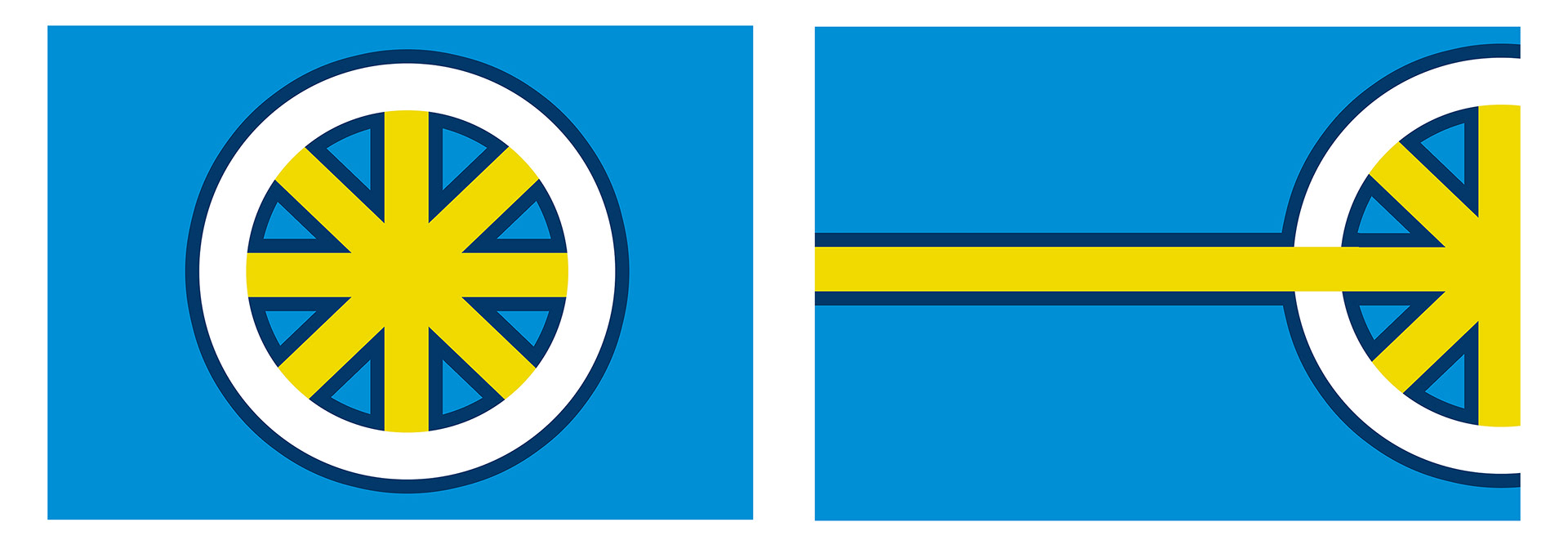
Boston City Flag, side by side of both versions.
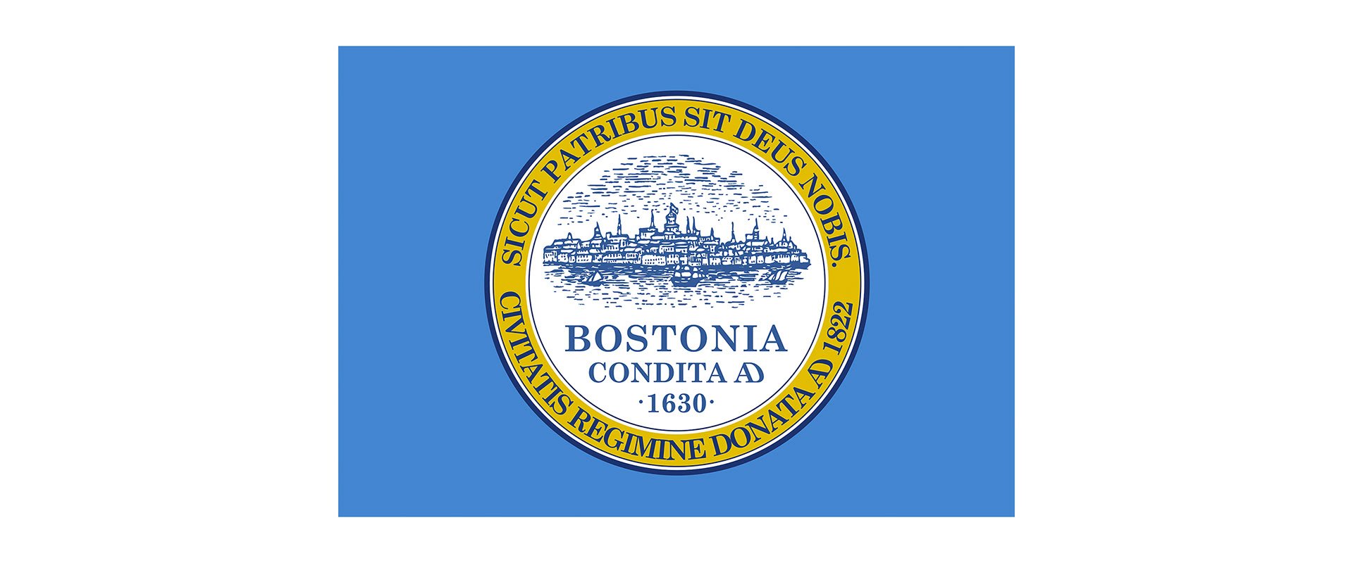
The current city flag of Boston.